
Want to share your content on R-bloggers? click here if you have a blog, or here if you don’t.
I am a father of two sons; one 4.5 years old, and the other is but a few months. This may seem weird, but even though I went through everything with my first son… I have complete amnesia about what was normal, what napping schedules were like, and such-like at this age.
Fortunately, we used a baby tracker, which allowed me to export a csv. What a golden opportunity for some data visualization!
Let’s just load up tidyverse and take a look…
Code in R
library(tidyverse)


child <- read_csv("https://github.com/drjohnrussell/drjohnrussell.github.io/raw/refs/heads/master/posts/2025-01-30-plotting-sleep-intervals/data/baby.csv")

head(child)
# A tibble: 6 × 3 Baby Time `Duration (min)`1 First-Born 10/23/20 4:30 AM 60 2 First-Born 10/23/20 6:00 AM 55 3 First-Born 10/23/20 8:31 AM 39 4 First-Born 10/23/20 11:13 AM 28 5 First-Born 10/23/20 3:49 PM 14 6 First-Born 10/23/20 7:16 PM 298
Hmmm, okay. So a few issues to deal with:
- the
Timecolumn is character data, instead of POSIXct - you have durations, instead of start times and end times
What I would love is a graph of my son’s sleep schedule, by week, that I could match up with our second child. So let’s see what we can do.
Creating a tidy time dataframe
The first thing to do is make sure that the data is in time. R has many functions, which you adapt to the way that the data looks. Here, the data is in month/day/year hour:minutes, so we can use mdy_hm as the function.
Code in R
child <- child |>
  mutate(starttime=mdy_hm(Time)) |>
  select(-Time)

head(child)
# A tibble: 6 × 3 Baby `Duration (min)` starttime1 First-Born 60 2020-10-23 04:30:00 2 First-Born 55 2020-10-23 06:00:00 3 First-Born 39 2020-10-23 08:31:00 4 First-Born 28 2020-10-23 11:13:00 5 First-Born 14 2020-10-23 15:49:00 6 First-Born 298 2020-10-23 19:16:00
We can similarly convert the Duration to minutes and add it to the starttime to get an endtime using the minutes function
Code in R
child <- child |>
  mutate(endtime=starttime+minutes(`Duration (min)`)) |>
  select(-`Duration (min)`)


head(child)
# A tibble: 6 × 3 Baby starttime endtime1 First-Born 2020-10-23 04:30:00 2020-10-23 05:30:00 2 First-Born 2020-10-23 06:00:00 2020-10-23 06:55:00 3 First-Born 2020-10-23 08:31:00 2020-10-23 09:10:00 4 First-Born 2020-10-23 11:13:00 2020-10-23 11:41:00 5 First-Born 2020-10-23 15:49:00 2020-10-23 16:03:00 6 First-Born 2020-10-23 19:16:00 2020-10-24 00:14:00
Separating out sleep at night
For the graph I’m imagining, where rectangles on a plot where show the time sleeping, my son sleeping through the night will actually be two rectangles; one that goes in the evening until midnight, and then one the following day from midnight until he wakes up.
This show up in the dataset as ones where the day of starttime and endtime are different.
Code in R
childnight <- child |>
  filter(day(starttime) != day(endtime))

## now make these into two different datasets. The evening dataset and the morning dataset

childevening <- childnight |>
  mutate(endtime=
           make_datetime(year(starttime), month(starttime), day(starttime), hour=23, min=59, sec=59))

childmorning <- childnight |>
  mutate(starttime=
           make_datetime(year(endtime), month(endtime), day(endtime), hour=0, min=0, sec=0))

## now filter them out and bind back in
child <- child |>
  filter(day(starttime) == day(endtime)) |>
  bind_rows(childevening,childmorning)
Now we have a dataset! Next problem.
Translating data into weeks old
Because my two sons were not born on the same day (or even the same month), looking at the data by date is not going to be helpful; ideally, I want to look at it in how many weeks old they are.
Code in R
birth <- mdy("05-30-20")
Using this birthdate, I can find the difference in time between the times sleeping and his birth. Using the floor function is akin to rounding down, which will allow me to see how many weeks old the baby was when sleep occurred.
Ideally, I want these dates converted into what week old, and what day of that week, factored for a plot that goes from midnight to midnight. My son was born on a Sunday, so this can go from Sunday to Saturday.
Code in R
child <- child |>
  mutate( ## this tells you how many weeks old
    weeksold=floor(difftime(starttime, birth, units="weeks")),
          ## this translates the dates into days of the week
    dayweek=wday(starttime,label=TRUE, ##labels over numbers,
                 abbr=TRUE, ##abbreviated,
                 week_start=7 ## Sunday
                 ),
    starthour=hm(paste0(hour(starttime),":",minute(starttime))),
    endhour=hm(paste0(hour(endtime),":",minute(endtime)))) |>
  select(-c(starttime,endtime))

head(child)
# A tibble: 6 × 5 Baby weeksold dayweek starthour endhour1 First-Born 20 weeks Fri 4H 30M 0S 5H 30M 0S 2 First-Born 20 weeks Fri 6H 0M 0S 6H 55M 0S 3 First-Born 20 weeks Fri 8H 31M 0S 9H 10M 0S 4 First-Born 20 weeks Fri 11H 13M 0S 11H 41M 0S 5 First-Born 20 weeks Fri 15H 49M 0S 16H 3M 0S 6 First-Born 21 weeks Sat 49M 0S 7H 20M 0S
Now we are ready to graph!
Graphing
geom_rect does not work well with categorical data, so we will use the fact that factors have numerical orders underneath them to graph.
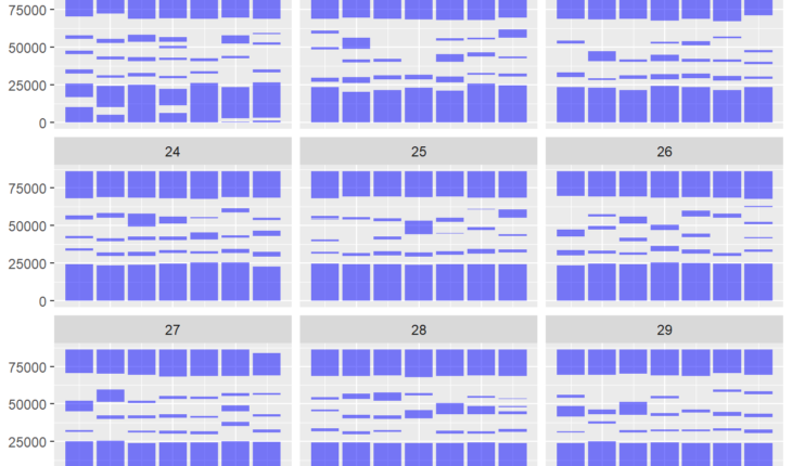
This creates a funny first graph.
Code in R
child |>
  filter(weeksold %in% c(21:29)) |>
  ggplot() +
  geom_rect(mapping=aes(xmin=as.numeric(dayweek)-.45,
                        xmax=as.numeric(dayweek)+.45,
                        ymin=starthour,
                        ymax=endhour),
            fill="blue", alpha=.5) +
  facet_wrap(~weeksold)
![]()
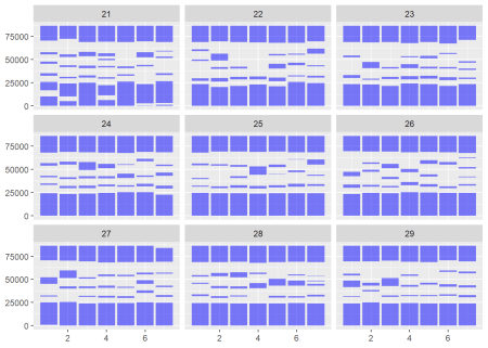
Notice that the y axis is in seconds since midnight, and that the x axis is in days since Sunday. Let’s work with our scales to make these right
Code in R
BREAKS <- c(0:12) * 7200 ## there are 3600 seconds in an hour, so this should make breaks every 2 hours

child |>
  filter(weeksold %in% c(21:29)) |>
  ggplot() +
  geom_rect(mapping=aes(xmin=as.numeric(dayweek)-.45,
                        xmax=as.numeric(dayweek)+.45,
                        ymin=starthour,
                        ymax=endhour),
            fill="blue", alpha=.5) +
  facet_wrap(~weeksold) +
  scale_y_time(breaks=BREAKS) +
  scale_x_continuous(
    breaks=seq_along(levels(child$dayweek)),
    labels=levels(child$dayweek)
  ) +
  labs(title="Sleep Schedule by Weeks Old, Weeks 21-29") +
  theme_light()
![]()
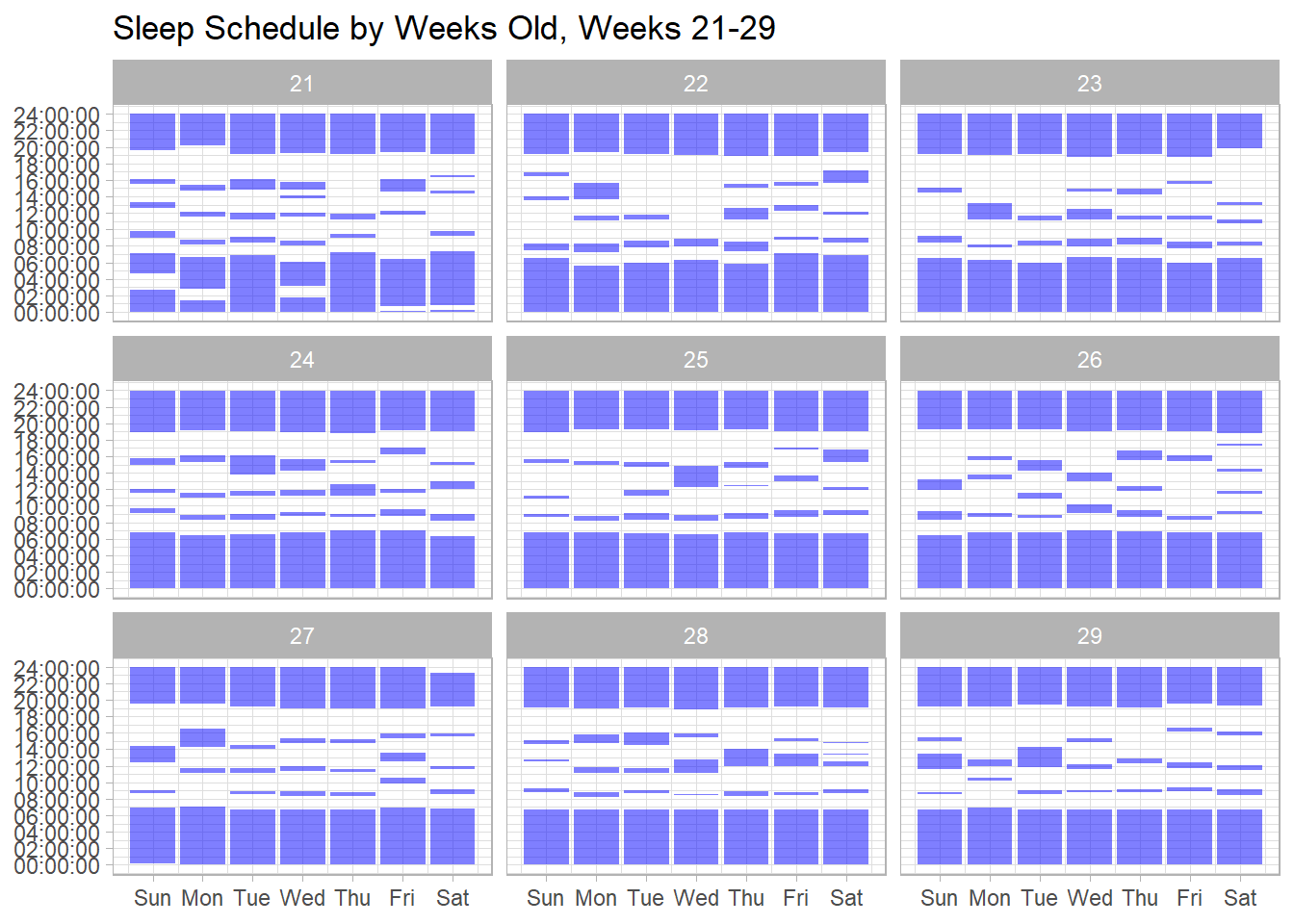
A graph to be proud of, and a reminder that my first son was a far better sleeper at night than my current…


