

Why Interactive Tables Matter
When people think of tables, they often picture static rows and columns, a no-frills way to present data. But interactive tables are a whole different story! These tables let users engage with the data directly, exploring it in ways that feel almost hands-on. Adding features like sorting, filtering, and searching transforms a simple table into a dynamic tool where readers can make their own discoveries.
So, why use interactive tables? Imagine you’re building a report for a large dataset. Instead of bogging down readers with endless rows and columns, you can let them filter out what they need or sort by their specific interests. For data professionals, this level of flexibility is invaluable — it allows anyone to find exactly what they’re looking for, without having to navigate through a mountain of data.
In this article, we’ll explore how R can help us create interactive tables across different contexts: from dashboards and reports to interactive web apps. With R’s powerful packages, like DT and reactable, you can bring tables to life with just a few lines of code. Let’s get started with the basics and work our way to some advanced features!
Getting Started with DT: DataTables in R
When it comes to building interactive tables in R, the DT package is a fantastic place to start. Developed as an interface to JavaScript’s DataTables library, DT enables you to quickly add interactive features to your tables without complex coding. This means you can create tables that support sorting, filtering, and navigating large datasets—all with minimal setup. Whether you’re designing a report, building a dashboard, or creating a web app, DT offers functionality that transforms static tables into dynamic data exploration tools.
One of the main appeals of DT is its ease of use. To get started, simply pass your dataset to DT::datatable(), and with just that, you’ll have a table that:
- Sorts each column by clicking the column header, allowing users to view data in their preferred order.
- Searches through all table content with a convenient search box above the table, so users can instantly locate specific information.
- Paginate large datasets, displaying a specified number of rows per page, making it easy to navigate through hundreds or thousands of rows without scrolling endlessly.
To see this in action, here’s a basic example using R’s built-in iris dataset. In this example, we’re creating a table that displays five rows per page:
library(DT)
# Creating a basic interactive table
datatable(iris, options = list(pageLength = 5, autoWidth = TRUE))

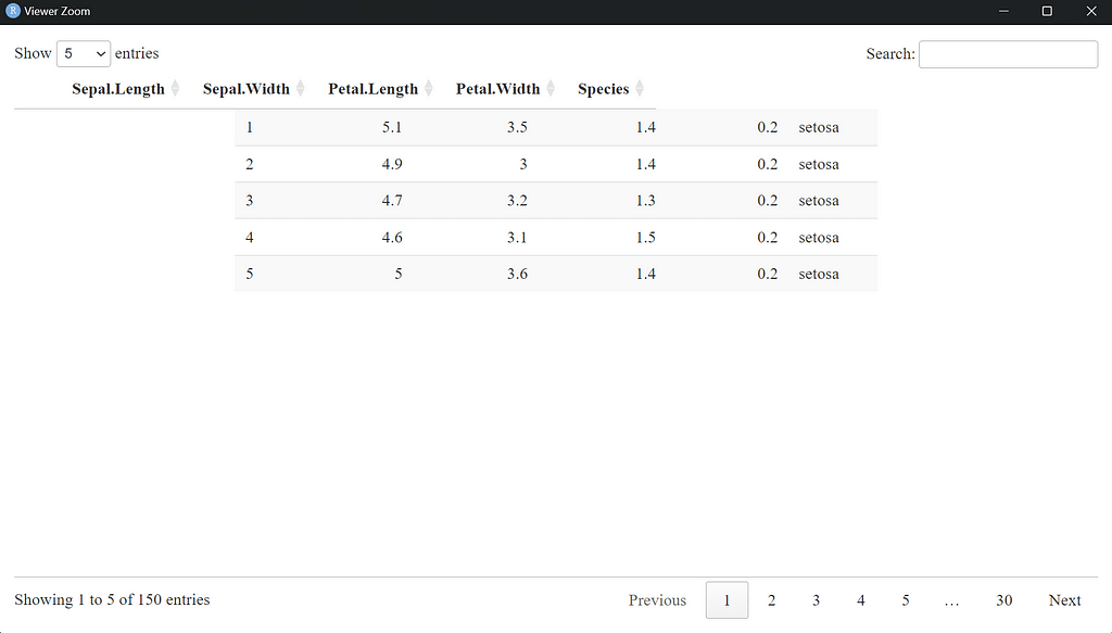
In this code:
- pageLength = 5 sets the number of rows visible at once to five, which is especially useful for datasets with many rows. This setting allows users to page through rows smoothly without feeling overwhelmed by the data.
- autoWidth = TRUE automatically adjusts column widths based on the data content, ensuring your table looks clean and well-organized.
This single line of code provides a fully interactive table that you can integrate into HTML-based documents, Shiny apps, or R Markdown reports. The table is easy to navigate, visually appealing, and functional. With DT, you can create a data table that allows users to explore your dataset directly and efficiently, all without having to build custom interfaces or write extensive JavaScript.
Customizing Tables in DT: More Control and Style
The basic setup for DT tables is functional and simple, but if you want your tables to truly shine, DT offers a wealth of customization options. These let you adjust not only the appearance but also the interactivity of your tables, giving users more control over how they explore the data. Customization can be especially useful for tailored reports or web-based dashboards where readers may have specific needs, such as filtering by certain values or only viewing select columns.
Adding Individual Column Filters
In many cases, a global search box is helpful, but if users need to filter specific columns independently, individual column filters make a big difference. For example, imagine you’re working with a dataset like iris, where users might want to see only rows with Sepal.Length above 5 or filter Species to show only specific categories. With DT, you can easily add filters for each column.
Here’s how to enable individual column filters:
datatable(iris, filter = "top", options = list(pageLength = 5))

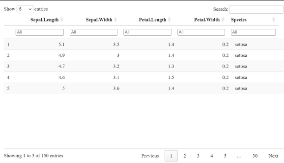
By setting filter = “top”, DT automatically places a filter box at the top of each column, giving users the flexibility to search for values independently. This feature can be particularly useful when working with larger datasets where users need to narrow down rows by specific values or ranges, allowing them to:
- Filter categorical data: Users can select one or more categories (e.g., filtering Species for “setosa” or “versicolor”).
- Filter numeric data: Users can set numeric filters (e.g., showing only rows where Sepal.Width is greater than 3).
- Search by partial matches: This can be helpful when columns contain text or unique identifiers.
These individual filters empower readers to explore data without cluttering the main table view. Instead of having to scan through all rows, users can focus on the exact data points they need, making for a highly personalized viewing experience.
Adjusting Page Length and Table Layout
When you’re working with large datasets, adjusting the page length — or the number of rows visible at once — improves readability and reduces scrolling. While displaying 5 rows per page works for smaller tables, larger datasets often benefit from showing more rows per page (e.g., 10 or 15), allowing users to view more data at a glance without extensive paging. You can set the page length to fit the specific needs of your project.
The layout, including table width and column visibility, can also affect readability. DT gives you control over layout settings through the dom parameter. This parameter specifies which elements (buttons, filters, search bars, etc.) are visible. Here’s how to adjust both page length and layout options:
datatable(
  iris,
  extensions = 'Buttons', # Enable the Buttons extension
  options = list(
    pageLength = 10,
    dom = 'Bfrtip',
    autoWidth = TRUE,
    buttons = c('copy', 'csv', 'excel', 'pdf', 'print') # Specify the types of buttons
  )
)

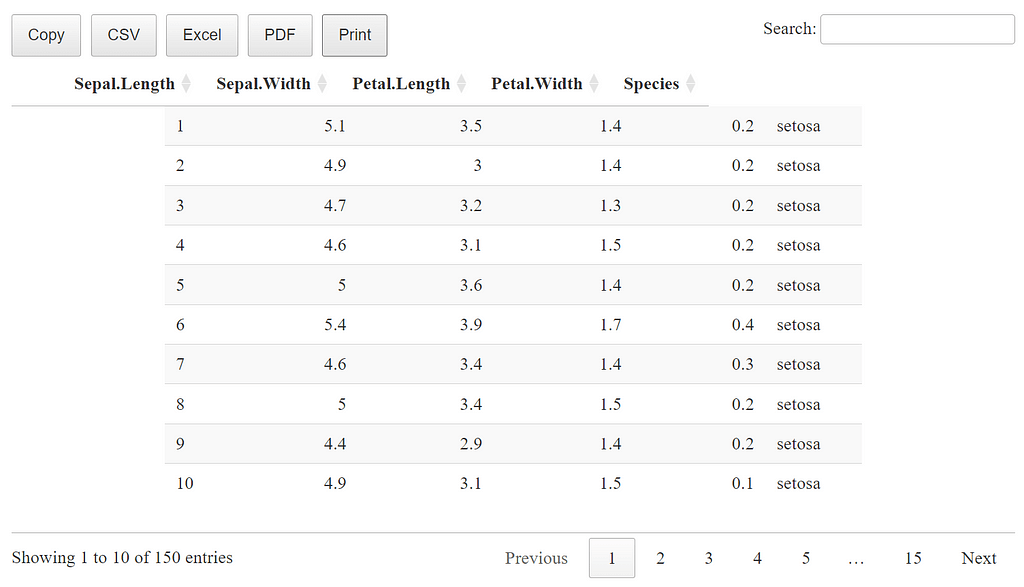
In this example:
- pageLength = 10 displays 10 rows at a time, making it easier to view more data per page.
- dom = ‘Bfrtip’ customizes the toolbar layout. Each letter represents a different component:
- B: Buttons (for exporting or downloading data)
- f: Filter (the search bar)
- r: Processing indicator (useful for larger tables)
- t: Table itself
- p: Pagination (for navigating pages)
This dom setting lets you control exactly which table features appear on the page, simplifying the view for readers. For example, if you’re using the table in a Shiny app and only need the table and pagination features, you could set dom = ‘tp’, which hides the search bar and toolbar to give a more streamlined look.
- autoWidth = TRUE automatically adjusts column widths to fit the content, which helps maintain a clean, proportional look without columns being too cramped or stretched.
- buttons = c(‘copy’, ‘csv’, ‘excel’, ‘pdf’, ‘print’): This argument specifies which export options to show in the toolbar.
Adding Styling and Conditional Formatting
In addition to adjusting layout, DT allows you to style your tables to improve readability and focus attention on key values. For example, you may want to highlight high values in a “price” column, or use color to differentiate specific categories. DT supports conditional formatting using the formatStyle() function, which allows you to apply styles to individual cells based on conditions.
Here’s how you could apply conditional formatting to highlight values in the Sepal.Length column that exceed a certain threshold:
datatable(iris, options = list(pageLength = 10)) %>%
  formatStyle(
    'Sepal.Length',
    backgroundColor = styleInterval(5.5, c('white', 'lightgreen'))
  )

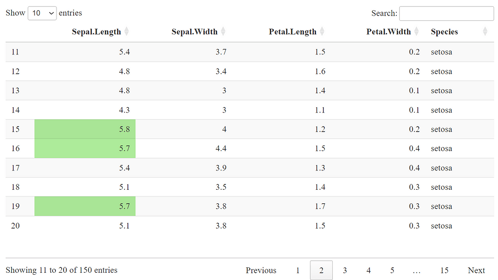
In this example:
- styleInterval() sets intervals for conditional formatting. Here, all values in Sepal.Length above 5.5 will have a light green background, while values below remain white.
- This type of formatting is particularly useful when you want to make certain data stand out. For instance, highlighting high or low values in financial data, differentiating categories by color, or adding visual cues for outliers.
Conditional formatting and custom styling give your tables an added layer of professionalism, especially useful in reports or presentations where certain data points need emphasis.
These customization options within DT allow you to tailor the look, feel, and functionality of your tables, ensuring that readers can navigate and interpret the data effectively. Whether you’re fine-tuning pagination, adding individual filters, or applying styling for impact, DT offers plenty of ways to enhance both usability and aesthetics.
reactable: Creating Stylish Interactive Tables
While DT is a fantastic choice for basic interactive tables, reactable takes customization to a new level, allowing for highly flexible and visually polished tables. Built on React, reactable provides rich interactivity and seamless customization, including column-specific settings, themes, and row expansions. If you’re creating tables for dashboards, reports, or any application that demands a bit more styling, reactable is a powerful tool to have.
With reactable, you can go beyond standard data displays by adding custom formats, colors, and even mini visualizations. Let’s start by creating a basic reactable table with the iris dataset and then dive into some customization options.
Creating a Basic reactable Table
Here’s a quick example of a basic interactive table using reactable:
library(reactable)

# Basic reactable table with iris dataset
reactable(iris, columns = list(
  Sepal.Length = colDef(name = "Sepal Length"),
  Sepal.Width = colDef(name = "Sepal Width"),
  Petal.Length = colDef(name = "Petal Length"),
  Petal.Width = colDef(name = "Petal Width"),
  Species = colDef(name = "Species")
))

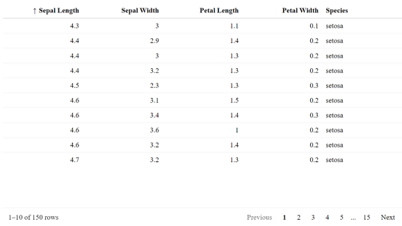
In this code:
- colDef() customizes each column with more readable names.
- This setup gives you a clean, sortable table that lets users click column headers to sort data. The columns are also resizable by default, providing flexibility for users to adjust the view.
Advanced Customization with colDef
One of the best features of reactable is the ability to define column-specific settings through colDef(), where you can set custom formatting, alignment, background colors, and even icons based on cell values. This makes it easy to highlight certain data points or apply thematic styling to fit your application’s design.
Let’s add a few customizations to the reactable table:
- We’ll style Species cells to include icons.
- Format Sepal.Length to two decimal places with color indicators.
reactable(iris, columns = list(
  Sepal.Length = colDef(
    name = "Sepal Length",
    align = "center",
    cell = function(value) {
      if (value > 5) paste0("🌱 ", round(value, 2)) else round(value, 2)
    },
    style = function(value) {
      if (value > 5) list(color = "green") else list(color = "black")
    }
  ),
  Species = colDef(
    cell = function(value) {
      if (value == "setosa") "🌸 Setosa" else value
    },
    align = "center"
  )
))

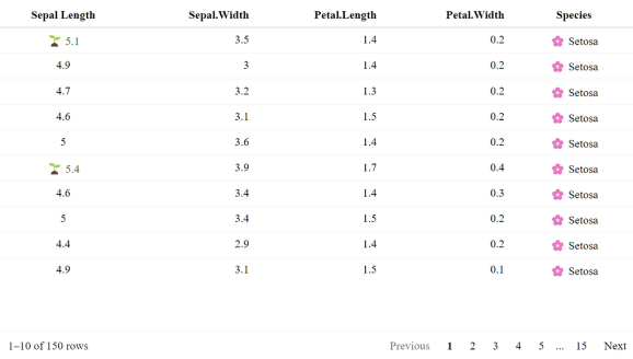
In this code:
- Custom Cell Content: In Sepal.Length, cells with values greater than 5 are prefixed with a small plant icon 🌱 and styled in green.
- Icons in Text Cells: For Species, we add a flower icon 🌸 for “setosa” values, making it more visually distinct.
- Alignment: By setting align = “center”, we ensure that the values appear centered in each cell, creating a cleaner look.
Applying Themes and Styling
reactable also comes with several built-in themes, or you can create your own custom styles using CSS to match any design you’re working with. Here’s an example of how to apply the “compact” theme with striped rows, which gives your table a sleek, modern look:
reactable(
  iris[1:30, ],
  searchable = TRUE,
  striped = TRUE,
  highlight = TRUE,
  bordered = TRUE,
  theme = reactableTheme(
    borderColor = "#dfe2e5",
    stripedColor = "#f6f8fa",
    highlightColor = "#fff000",
    cellPadding = "8px 12px",
    style = list(fontFamily = "-apple-system, BlinkMacSystemFont, Segoe UI, Helvetica, Arial, sans-serif"),
    searchInputStyle = list(width = "100%")
  )
)

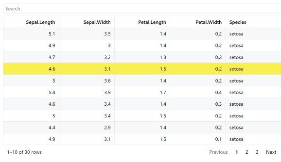
This example adds:
- Striped Rows: Alternating row colors make it easier to read across large datasets.
- Highlighting: Selected rows are highlighted to improve navigation.
- Compact Layout: Reduces padding for a more compressed view, ideal for tables with many rows.
With reactable, you have flexibility over everything from themes and icons to row expandability. The package is particularly suited for dashboards, apps, and reports where style and interactivity are both high priorities.
Integrating Interactive Tables in Shiny
Interactive tables become even more powerful in the context of Shiny apps, where they can respond to user inputs in real-time. By integrating tables from DT or reactable into a Shiny app, you can allow users to filter, sort, and explore data while responding to additional controls, like sliders or dropdowns. This flexibility makes Shiny ideal for creating dashboards, reports, or custom data exploration tools.
Creating a Basic Shiny App with DT
Let’s start with a simple Shiny app that uses DT to display an interactive table. In this example, we’ll use a slider to allow users to filter rows based on Sepal Length from the iris dataset:
library(shiny)
library(DT)

# Define the UI
ui <- fluidPage(
  titlePanel("Iris Dataset Interactive Table"),
  sidebarLayout(
    sidebarPanel(
      sliderInput("sepal", "Filter by Sepal Length:",
                  min = min(iris$Sepal.Length), max = max(iris$Sepal.Length),
                  value = c(min(iris$Sepal.Length), max(iris$Sepal.Length)))
    ),
    mainPanel(
      DTOutput("table")
    )
  )
)

# Define the server logic
server <- function(input, output) {
  output$table <- renderDT({
    # Filter the data based on slider input
    filtered_data <- iris[iris$Sepal.Length >= input$sepal[1] & iris$Sepal.Length <= input$sepal[2], ]
    datatable(filtered_data, options = list(pageLength = 5))
  })
}

# Run the application
shinyApp(ui = ui, server = server)

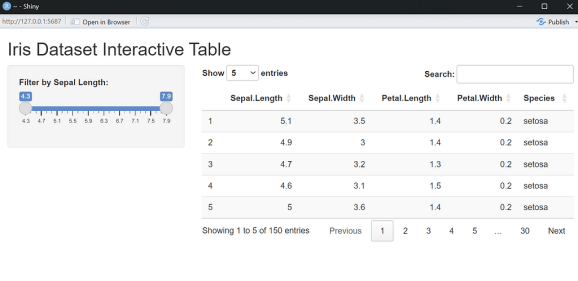
In this example:
- Slider Input: The sliderInput in the UI allows users to filter the table by Sepal Length values. The slider is set to the range of Sepal Length in the dataset, so users can choose any range within those values.
- Filtering Data in Server: In the server function, we filter iris based on the slider values and then render the filtered table using renderDT().
- Table Output: DTOutput displays the filtered table in the main panel, showing 5 rows per page.
This basic Shiny app provides users with control over what they see, allowing them to explore the dataset interactively with the filter.
Using reactable for Customization in Shiny
If you want even more control over the table’s appearance and functionality, you can use reactable in your Shiny app. Here’s an example of a similar Shiny app with reactable, where we add an input for selecting specific Species to filter by:
library(shiny)
library(reactable)

# Define the UI
ui <- fluidPage(
  titlePanel("Interactive Table with reactable"),
  sidebarLayout(
    sidebarPanel(
      selectInput("species", "Select Species:",
                  choices = c("All", unique(as.character(iris$Species)))),
      sliderInput("sepal", "Filter by Sepal Length:",
                  min = min(iris$Sepal.Length), max = max(iris$Sepal.Length),
                  value = c(min(iris$Sepal.Length), max(iris$Sepal.Length)))
    ),
    mainPanel(
      reactableOutput("reactable_table")
    )
  )
)

# Define the server logic
server <- function(input, output) {
  output$reactable_table <- renderReactable({
    # Filter data based on user inputs
    filtered_data <- iris[iris$Sepal.Length >= input$sepal[1] & iris$Sepal.Length <= input$sepal[2], ]
    if (input$species != "All") {
      filtered_data <- filtered_data[filtered_data$Species == input$species, ]
    }

    # Render the reactable table
    reactable(filtered_data,
              columns = list(
                Sepal.Length = colDef(name = "Sepal Length"),
                Sepal.Width = colDef(name = "Sepal Width"),
                Petal.Length = colDef(name = "Petal Length"),
                Petal.Width = colDef(name = "Petal Width"),
                Species = colDef(name = "Species")
              ),
              striped = TRUE, highlight = TRUE)
  })
}

# Run the application
shinyApp(ui = ui, server = server)
In this enhanced version:
- Species Filter: The selectInput lets users choose a specific species or view all species in the table. This input is especially useful for focusing on subsets within categorical data.
- Slider and Select Filter Combination: We filter by Sepal Length range and Species, providing two levels of control over what users see.
- reactable Styling: striped = TRUE and highlight = TRUE options add styling to make the table easier to read and navigate.
With reactable in Shiny, users get a polished table with styling and functionality that can adapt dynamically to any dataset they’re exploring.
Enhancing Tables with Advanced Extensions
Now that we’ve covered interactivity, let’s take a look at some tricky extensions that can add advanced customization, small in-table visualizations, and complex formatting to your tables. While they may not add interactivity in the same way as DT or reactable, these packages help you create visually stunning tables that can make your data come alive in reports and presentations. Here’s a rundown of some of the best tools for taking your tables from basic to brilliant.
kableExtra: Advanced Formatting for Markdown Tables
If you’re using knitr::kable() to create tables in R Markdown, kableExtra is a perfect companion. It provides advanced styling options to add borders, bold headers, row grouping, and even color coding, making your tables far more visually appealing and readable.
Example: Creating a Styled Table with kableExtra

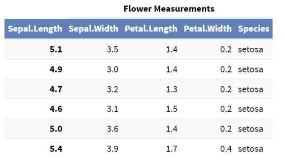
In this example:
- kable_styling() adds bootstrap options to apply striping, hovering, and condensed spacing.
- row_spec() makes the header row bold, with a custom color and background, drawing the reader’s attention to column titles.
- column_spec() applies bold formatting to the first column to distinguish it visually.
- add_header_above() creates a merged header spanning multiple columns.
gtExtras: Adding Visuals to gt Tables
If you’re using gt for creating high-quality tables, gtExtras can help you take it to the next level. This extension enables you to add sparklines, bar charts, lollipop charts, and other mini visualizations directly within cells. It’s a great way to add trend data, comparisons, or distribution insights to your tables without relying on external plots.
Example: Adding Sparklines and Mini Bar Charts with gtExtras
library(gt)
library(gtExtras)
library(dplyr)

# Prepare example data with a trend for each row
iris_summary <- iris %>%
  group_by(Species) %>%
  summarize(
    Avg_Sepal_Length = mean(Sepal.Length),
    Sepal_Length_Trend = list(sample(4:8, 10, replace = TRUE))
  )

# Create a gt table with sparklines for trends
gt(iris_summary) %>%
  gt_plt_sparkline(Sepal_Length_Trend) %>%
  tab_header(title = "Iris Species Summary", subtitle = "Including Sepal Length Trends")

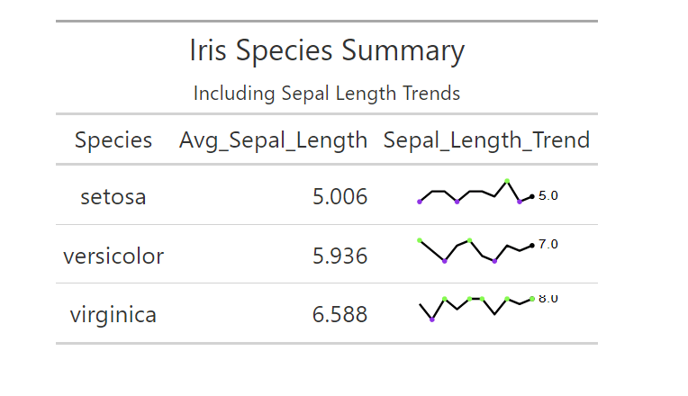
In this example:
- gt_plt_sparkline() adds a sparkline within the Sepal_Length_Trend column, showing trends for each species.
- tab_header() provides a title and subtitle for context.
With gtExtras, your tables can communicate more than just static data — they can tell a story by visually showcasing trends and distributions right in the table cells.
formattable: In-Cell Visualizations for DataFrames
The formattable package is another powerful tool for creating visually enhanced tables, particularly useful for adding color-coded scales, bars, and visual indicators based on cell values. It’s designed to help you visualize comparisons directly within a data.frame, making it ideal for quick dashboards or reports.
Example: Adding Color Scales and Mini Bars with formattable
library(formattable)

# Create a formattable table with in-cell color scales and bars
formattable(
  iris,
  list(
    Sepal.Length = color_tile("lightblue", "lightgreen"),
    Sepal.Width = color_bar("pink"),
    Petal.Length = formatter("span",
                             style = x ~ style(font.weight = "bold", color = ifelse(x > 4, "red", "black")))
  )
)

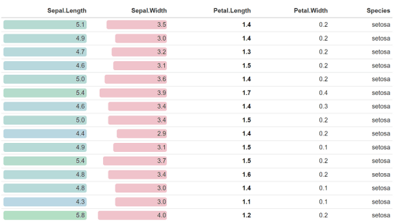
In this example:
- color_tile() applies a background color gradient to Sepal.Length, making it easy to compare values visually.
- color_bar() adds a color bar in Sepal.Width cells, giving a quick visual cue of relative size.
- formatter() applies conditional font styling to Petal.Length, highlighting values above a threshold in red.
flextable: Creating Word and PowerPoint-Compatible Tables
For reports destined for Word or PowerPoint, flextable is a robust choice, offering rich customization options that ensure your tables look polished in these formats. With flextable, you can merge cells, add images, and apply various themes, making it a go-to option for tables that need to be embedded in professional documents.
Example: Customizing a Table for Word with flextable
library(flextable)

# Create a flextable with merged headers and styling
ft <- flextable(head(iris))
ft <- set_header_labels(ft, Sepal.Length = "Sepal Length", Sepal.Width = "Sepal Width")
ft <- add_header_row(ft, values = c("Flower Measurements"), colspan = 4)
ft <- theme_vanilla(ft)
ft <- autofit(ft)

# Save to Word
# save_as_docx(ft, path = "iris_table.docx")
ft

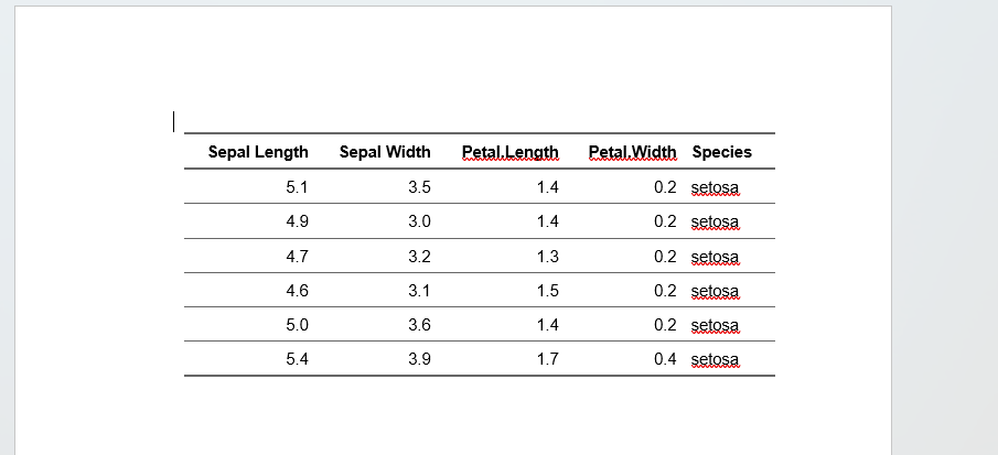
Each of these packages offers unique strengths for customizing tables, making them valuable tools for any R user aiming to create more engaging, insightful, and visually appealing tables. Whether you’re building tables with in-cell visualizations, integrating trends with sparklines, or creating print-ready documents, these extensions let you go beyond basics and add a professional polish to your work.
Bringing Data to Life with Interactive and Enhanced Tables
Tables may seem simple, but they’re one of the most powerful tools for data communication. In this article, we’ve explored how to transform tables from static rows and columns into dynamic, interactive tools using R’s DT and reactable packages. Whether in a Shiny app or a standalone report, these tables allow readers to explore, filter, and engage with data in real-time, making data insights accessible to everyone.
And when interactivity isn’t needed, we’ve looked at advanced table extensions like kableExtra, gtExtras, formattable, and flextable, which bring tables to life with beautiful formatting, in-cell visualizations, and high-quality styling options. These tools ensure your tables aren’t just functional—they’re visually compelling and professionally polished.
By combining interactivity with powerful formatting extensions, you have everything you need to craft tables that both captivate and communicate effectively. Now, you’re ready to bring data to life, one table at a time!
![]()
Data at Your Fingertips: Crafting Interactive Tables in R was originally published in Numbers around us on Medium, where people are continuing the conversation by highlighting and responding to this story.
Related


