

Want to share your content on R-bloggers? click here if you have a blog, or here if you don’t.
What is data-driven art?
At first I thought the answer to the question what is data art? would be relatively straightforward. I initially started with the definition that data art lies somewhere between data visualisation and generative art. Where data visualisation aims to accurately represent data to communicate insights, generative art uses algorithms to create unique visuals which often incorporate randomness or predefined rules. Like generative art, the primary aim of data art is artistic impact, rather clarity or analysis. On reflection, I realised this definition excludes some types of data art – mainly those created without the use of a computer. So although I think this definition is still somewhat correct, it only applies to a subset of data art.
After a little bit of thinking, the definition I came up with is:
Data art (or data-driven art): a genre of art which transforms data into aesthetically-pleasing compositions with the aim of evoking emotion or displaying hidden patterns.
Notably, this definition is broad enough to include works created by hand such as paintings and crocheted blankets, non-visual pieces such as musical representations, as well as the more obvious, abstract digital visualisations from my original definition. In terms of where it fits into the broader landscape of artistic works, the diagram below makes an attempt at illustrating that. I believe data art is much more abstract than traditional data visualisations but less abstract that generative art. It’s also less likely to be computer-generated than generative art, but more likely to be computer-generated than a portrait painting.
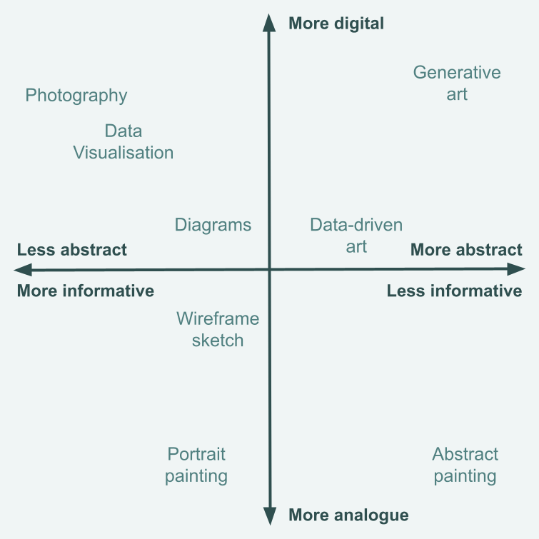
I also asked ChatGPT to give me a definition of data-driven art and it said: Data-driven art is creative work that transforms raw data into visual or interactive forms using algorithms, patterns, or real-time inputs.. Personally, I think that only the first half of that sentence is necessary and correct.
Why is data-driven art important?
When thinking about data visualisations, we often think about how to convey a message as clearly and honestly as possible – thinking about elements such as appropriate axes, informative titles, and chart types. We don’t necessarily think about these factors when creating data art. And that’s because it has a different purpose. The aim of data art isn’t to communicate statistics or to explore data before further analysis. The main aim (in my opinion) of data art is to evoke emotion. Art can make data more memorable and impactful, especially when the data relates to sensitive or emotional topics. When people connect emotionally with data, they are more likely to engage with it, understand its significance, and reflect on its implications. This emotional connection can drive awareness, inspire action, or challenge perspectives in ways that raw numbers or traditional data visualisations can’t.
Data art can also have another benefit – it may help to protect against confirmation bias. If we’re looking at a traditional data visualisation, we may look for patterns and see what we expect to see. For example, focusing on one category of interest but not paying as much attention to patterns in other categories. But when we look at data art, which is most often abstracted and without textual labels to identify data, it allows us to see patterns without our preconceptions, before we know what underlying data is being represented.
Creating your own data-driven art
You don’t need to identify as an artist, or as a data visualisation expert, to create data-driven art. You don’t even need to be able to use data processing or visualisation software.
What do you want to say?
As with data visualisation, the first thing to think about is the purpose of your work. What do you want to show? What do you want people to see? What do you want people to feel? It’s often easier to think about these questions in the context of an example. So let’s take
life expectancy data from Our World in Data as an example and think about how we might create data art.
What stories could we tell with data art?
- The gap in life expectancy between the richest and poorest countries in the world?
- How life expectancy has changed over time for a specific country?
- The patterns in the rankings of countries based on life expectancy?
Let’s go for that last option.
Starting with sketching
Whether you use pen and paper or digital tools, sketching is a great way to explore ideas for both data art and data visualisations. It’s a quick way to outline an idea, and (because it’s just a sketch) it’s easy to throw it away if it doesn’t work!
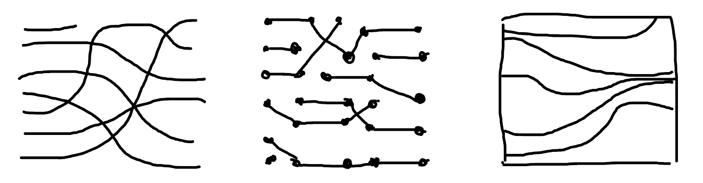
Your sketches might be inspired by different chart types, by other pieces of art you’ve seen, or by the patterns you see in a random object! In the sketches above, the x-axis shows time, which is a common approach in data visualisaton, and the y-axis shows the ranking. You might also think about how you could present the data using a chart type that wouldn’t be recommended for a traditional data visualisation. For example, could you present ranking data in a proportional area chart?
Adapting from a chart
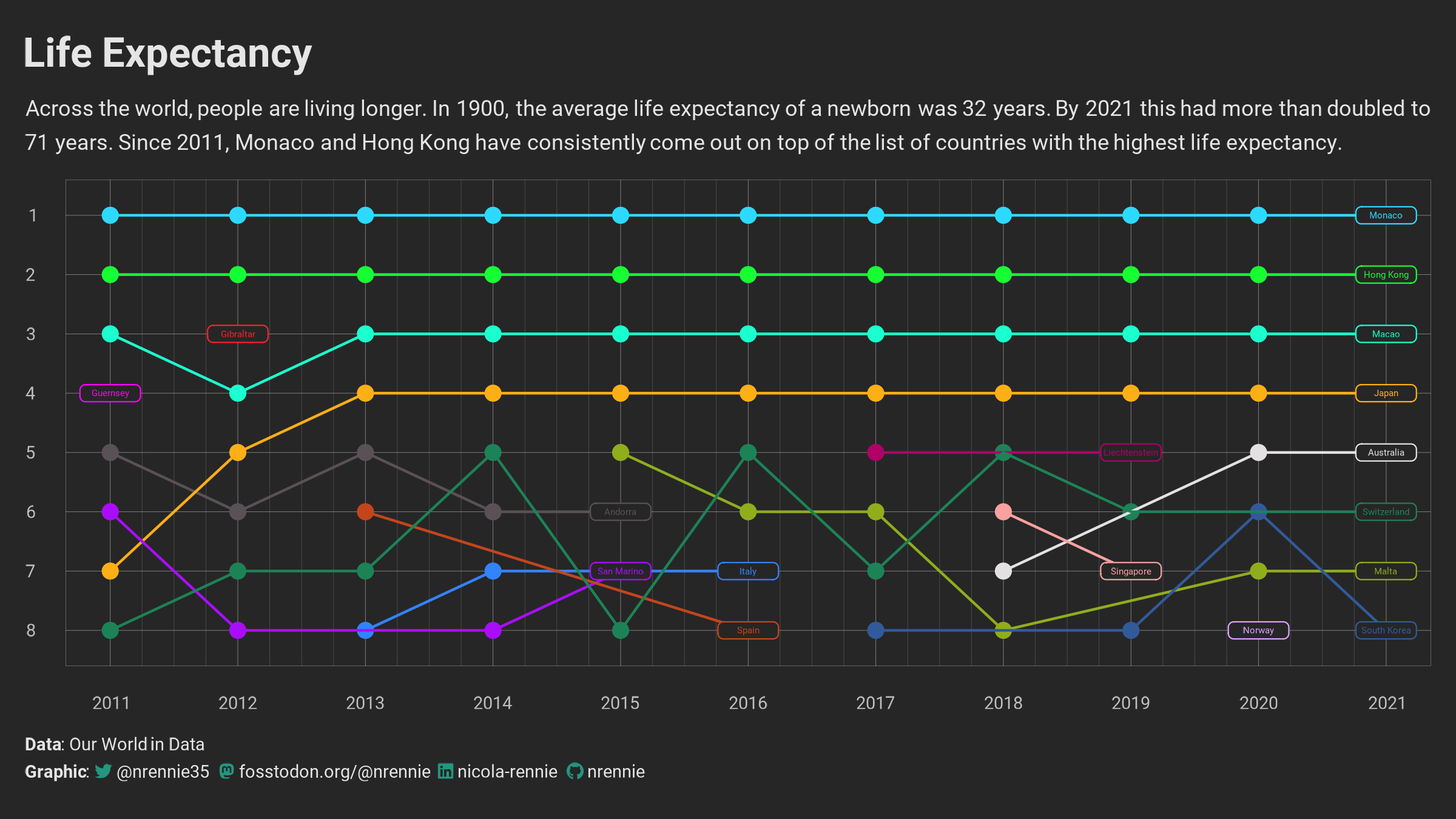
An alternative place to start creating data art is from an existing, traditional data visualisation. It can be a good way to draw attention to a wider piece of analysis that you’ve done. For the example of life expectancy rankings, we may have a line chart showing the rankings over time, with each country in a different colour and direct labels identifying the country. Perhaps something like the one shown below. The code for this visualisation can be found on
GitHub.
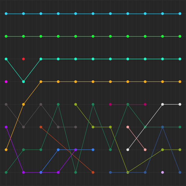
To transform it from a data visualisation to a piece of data art, there are a few different adjustments we can try:
- Remove the title, subtitle, and caption text as well as the axis labels and titles to make it immediately more abstract.
- Remove labels and legends, perhaps also grid lines.
- Choose colours that are aesthetically pleasing, even if some groups are not as visually distinct. Perhaps the lack of distinction between groups is something you’re trying to show?
- Play around with different aspect ratios and arrangements. Try different coordinate systems.
- Layer multiple charts on top of each other.
Of course, these are just suggestions to play around with – your art is whatever you want it to be?
Show code: Python or R
Python
1 2 3 4 5 6 7 8 9 10 11 12 13 14 15 16 17 18 19 20 21 22 23 24 25 26 27 28 29 30 31 32 33 34 35 36 37 38 39 40 41 42 43 44 45 46 47 48 49 50 51 |
import pandas as pd
import numpy as np
import plotnine as gg
import matplotlib.pyplot as plt

# Data
life_expectancy = pd.read_csv('https://raw.githubusercontent.com/rfordatascience/tidytuesday/main/data/2023/2023-12-05/life_expectancy.csv')

# Colours
bg_col = "#262626"
text_col = "#e5e5e5"

# Wrangling
plot_data = (life_expectancy
 .query("Year >= 2011 and Year <= 2021")
 .groupby("Year", group_keys=False)
 .apply(lambda x: x.nlargest(8, "LifeExpectancy"))
 .sort_values(by=["Year", "LifeExpectancy"], ascending=[True, False])
 .reset_index(drop=True)
)
plot_data["rank"] = plot_data.groupby("Year").cumcount() + 1
plot_data["rank"] = plot_data["rank"].astype(str)

# Colours
colors = ["#5A5156", "#E4E1E3", "#F6222E", "#FE00FA", "#16FF32", "#3283FE", "#FEAF16", "#B00068", "#1CFFCE", "#90AD1C", "#2ED9FF", "#DEA0FD", "#AA0DFE", "#F8A19F", "#325A9B", "#C4451C", "#1C8356"]

# Plot
g = (
 gg.ggplot()
 + gg.geom_point(gg.aes(x="Year", y="rank", color="Entity"), data=plot_data, size=2.5)
 + gg.geom_line(gg.aes(x="Year", y="rank", color="Entity", group="Entity"), data=plot_data)
 + gg.scale_x_continuous(expand=(0, 0.1), limits=(2010.75, 2021.25), breaks=np.arange(2011, 2022), minor_breaks=np.arange(2011, 2021.25, 0.25))
 + gg.scale_y_discrete(limits=reversed)
 + gg.scale_color_manual(values=colors)
 + gg.theme_light()
 + gg.theme(
 legend_position="none",
 plot_margin=0,
 axis_title=gg.element_blank(),
 axis_text=gg.element_blank(),
 plot_background=gg.element_rect(fill=bg_col, color=bg_col),
 panel_background=gg.element_rect(fill=bg_col, color=bg_col),
 panel_grid_major_y=gg.element_line(color=text_col, alpha=0.5, size=0.1),
 panel_grid_major_x=gg.element_line(color=text_col, alpha=0.5, size=0.1),
 panel_grid_minor_x=gg.element_line(color=text_col, alpha=0.2, size=0.1),
 panel_border=gg.element_rect(color=text_col, alpha=0.7, fill=None, size=0.1),
 axis_ticks=gg.element_blank(),
 figure_size = (6, 6)
 )
)
g.draw()
|
R
1 2 3 4 5 6 7 8 9 10 11 12 13 14 15 16 17 18 19 20 21 22 23 24 25 26 27 28 29 30 31 32 33 34 35 36 37 38 39 40 41 42 43 44 45 46 47 48 49 50 51 52 53 54 55 56 |
library(tidyverse)

# Data
life_expectancy <- readr::read_csv("https://raw.githubusercontent.com/rfordatascience/tidytuesday/main/data/2023/2023-12-05/life_expectancy.csv")

# Colours
bg_col <- "#262626"
text_col <- "#e5e5e5"

# Wrangling
plot_data <- life_expectancy |>
 filter(Year %in% seq(2011, 2021, by = 1)) |>
 group_by(Year) |>
 slice_max(LifeExpectancy, n = 8) |>
 arrange(Year, desc(LifeExpectancy)) |>
 mutate(rank = row_number()) |>
 ungroup() |>
 mutate(rank = factor(rank, levels = 1:8))

# Colours
colors <- c("#5A5156", "#E4E1E3", "#F6222E", "#FE00FA", "#16FF32", "#3283FE", "#FEAF16", "#B00068", "#1CFFCE", "#90AD1C", "#2ED9FF", "#DEA0FD", "#AA0DFE", "#F8A19F", "#325A9B", "#C4451C", "#1C8356")

# Plot
g <- ggplot() +
 geom_point(
 data = plot_data,
 mapping = aes(x = Year, y = rank, colour = Entity),
 size = 2.5
 ) +
 geom_line(
 data = plot_data,
 mapping = aes(x = Year, y = rank, colour = Entity, group = Entity)
 ) +
 scale_x_continuous(
 expand = expansion(0, 0.1),
 limits = c(2010.75, 2021.25),
 breaks = 2011:2021,
 minor_breaks = seq(2011, 2021, by = 0.25)
 ) +
 scale_y_discrete(limits = rev) +
 scale_colour_manual(values = colors) +
 theme_void() +
 theme(
 legend.position = "none",
 plot.margin = margin(5, 10, 5, 10),
 axis.title = element_blank(),
 axis.text = element_blank(),
 plot.background = element_rect(fill = bg_col, colour = bg_col),
 panel.background = element_rect(fill = bg_col, colour = bg_col),
 panel.grid.major.y = element_line(colour = alpha(text_col, 0.5), linewidth = 0.1),
 panel.grid.major.x = element_line(colour = alpha(text_col, 0.5), linewidth = 0.1),
 panel.grid.minor.x = element_line(colour = alpha(text_col, 0.2), linewidth = 0.1),
 panel.border = element_rect(colour = alpha(text_col, 0.7), fill = NA, linewidth = 0.1),
 axis.ticks = element_blank()
 )
g
|
Although this example is created using Python, you don’t need to use digital tools to create data art. This same piece of art could have been created with paper and crayons just the same!
Inspiration and examples
If you’re looking for some more data art examples to inspire you, here are a few I recommend:
-
Examples of data art created by students at Amherst College using data on studies that investigate racial and ethnic disparities in reproductive medicine can be found at
katcorr.github.io/this-art-is-HARD. Their work inspired the piece displayed in the cover image of this blog post. -
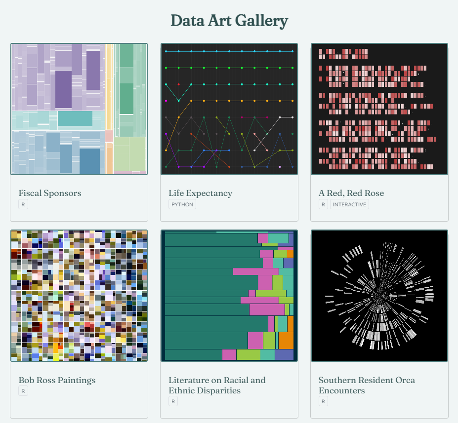
My
Data Art Gallery is collection of data art examples, which includes the R or Python code used to create it. Each example includes a synopsis of the underlying data, and how the art is used to represent it.
-
The
Environmental Graphiti has many examples of art inspired by the science of climate change, with each digital work derived from a chart, map, word or number related to the topic. -
The
Tableau Data Art Gallery showcases beautiful examples of visualisations and data art created with Tableau.
Related


