Summary: In this guest post, Brian A Mikelbank, Associate Professor of Urban Studies at Cleveland State University, shares how he used R to explore the likely causes of license suspensions in Ohio, USA.
Packages Required:
Data:
Background
I’m a quantitative urban geographer, on the faculty at Cleveland State University, where I focus on ‘urban spatial process‘, which tries to understand how space impacts the processes that produce, maintain, and alter our urban surroundings, such as housing, migration, the economy etc.) . I’m also interested in the analysis tools that help us identify and understand spatial patterns, because understanding these patterns can help us understand what caused them.
Before learning R, I had been working across multiple software platforms to do my analyses – mainly Excel, SPSS, GeoDa, and ArcGIS. I wasn’t limited in the research questions I could ask, but it was inefficient moving datasets back and forth from one program to another. Additionally, it was a burden keeping track of data decisions I made along the way across the multiple platforms, and replicating the work was inefficient and time consuming.
I was looking for a way to bring all of my research tasks under one software umbrella. I had heard of R, so when the university hosted a Saturday morning “Introduction to R for Data Visualization” workshop, I made sure to attend. The utility of R was immediately clear: not only would it provide an opportunity to move my entire analysis pipeline to a single piece of software, but it was clear that the the language would open up an almost unlimited array of opportunities for analyzing, understanding and visualizing data.
Shortly thereafter, I decided to sign up to an introduction to R for policy analysis course that was announced on R-bloggers.com.
Debt-Related License Suspensions in Ohio, USA
In 2020, I joined a group of attorneys at the Legal Aid Society of Cleveland who were looking into the topic of debt-related driver’s license suspensions.
Their interest in license suspension stemmed from the fact that debt-related suspensions can trap drivers with limited resources in a vicious cycle: fines and fees for seemingly minor traffic infringements can easily spiral into thousands of dollars of debt. Drivers, being unable to repay these debts, then are unable to drive. Making it even more difficult for them to to earn the money needed to pay down the debt.
But, what do you think is the leading cause of driver’s license suspensions?
I bet you answered something like dangerous driving, speeding, drunk driving, or something similar. For the State of Ohio, you’d be wrong. Most suspensions in Ohio are due to the driver not being able to pay a fine or fee. Debt. It can have absolutely nothing to do with dangerous driving!
If you’re interested in the topic, I’d recommend taking a look at our white paper.
Data
We crafted a public records request to the Ohio Bureau of Motor Vehicles, and in return received approximately 40 excel files, each with 5-10 separate worksheets (I can’t imagine organizing, aggregating, and analyzing these data without R!).
We had data from 2016 to 2020 for Ohio ZIP Codes, which included information on 8 different types of debt-related suspensions (captured in the ‘type’ variable). For each type we also had data on the amount charged, paid, and the amount owing at the end of the year (captured in the ‘indicator’ variable).
We focus on 2019, as this was the most recent ‘typical’ year where data was available when we conducted the research.
First, let’s read in the data and examine the structure of the data (contained in drs_2019.RDS) and produce summary statistics for the dataset:
library(tidyverse)
drs_2019 <- readRDS("drs.RDS")

acs <- readRDS("acs.RDS")

str(drs_2019)
It appears the dataset contains five variables with a little over 300K observations.
## tibble [300,516 x 5] (S3: tbl_df/tbl/data.frame)
##  $ zip      : num [1:300516] 43001 43002 43003 43004 43005 ...
##  $ year     : num [1:300516] 2016 2016 2016 2016 2016 ...
##  $ type     : Factor w/ 8 levels "child support",..: 3 3 3 3 3 3 3 3 3 3 ...
##  $ indicator: Factor w/ 5 levels "charged","owed",..: 5 5 5 5 5 5 5 5 5 5 ...
##  $ value    : num [1:300516] 7 2 23 202 1 4 59 4 1 34 ...
The summary statistics also give us a good sense of the information contained in the dataset. In particular, notice that the ‘indicator’ variable makes it possible to understand the number of suspensions, suspended drivers and the amount charged, owed and paid over time (using the year variable).
summary(drs)
Min.   : 4410   Min.   :2019   non-compliance    :10628   charged          : 7104
 1st Qu.:43735   1st Qu.:2019   warrant block     : 9365   owed             : 9020
 Median :44440   Median :2019   license forfeiture: 9132   paid             : 5745
 Mean   :44464   Mean   :2019   child support     : 7596   suspended drivers:19432
 3rd Qu.:45241   3rd Qu.:2019   random selection  : 7433   suspensions      :19432
 Max.   :45969   Max.   :2019   judgement         : 6542
 NA's   :25                     (Other)           :10037
     value
 Min.   :      0
 1st Qu.:      7
 Median :     56
 Mean   :  19020
 3rd Qu.:    700
 Max.   :6484764
Understanding suspensions by type
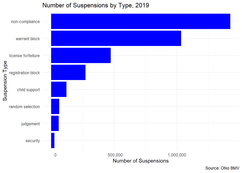
Looking at the plot below you can see the eight types of debt-related driver’s license suspensions. Notice that ‘non-compliance’ suspensions are the most common, which occurs when a driver fails to show proof of car insurance.
# make the plot
ggplot(data=drs_type, aes(x=total, y = reorder(type, total)))+
  geom_col(fill = "blue")+
  labs(
    title = "Number of Suspensions by Type, 2019",
    caption = "Source: Ohio BMV",
    y = "Suspension Type",
    x = "Number of Suspensions"
  )+
  scale_x_continuous(labels = function(x) format(x, big.mark = ",",
                                                 scientific = FALSE))+
  theme_minimal()
You can now see the 8 types of debt-related driver’s license suspensions and that non-compliance suspensions are the most common. A non-compliance suspension occurs when a driver fails to show proof of car insurance.

Financial Analysis of Suspensions
Next, let’s explore the financial aspects of these suspensions. Suspensions typically carry with them financial penalties in addition to the unpaid debt that is at the core of the suspension in the first place. For a given year, we know the new amount charged, the amount that was paid during that year, and the amount that was still owed at the end of the year.
# Charged, paid, and owed by type
# these are the financial variables:
cpo <- c("charged", "paid", "owed")

cpo_type <- drs_2019 %>%
  filter(indicator %in% cpo)%>%
  mutate(indicator = factor(indicator, levels = c("paid", "charged", "owed"))) |>
  group_by(type, indicator)%>%
  summarize(total=sum(value))

# make the plot (in millions)
ggplot(data=cpo_type, aes(x=total/1000000, y = reorder(type, total), fill = indicator))+
  geom_col(position = "dodge")+
  labs(
    title = "Amounts Owed, Charged, and Paid by Suspension Type, 2019",
    caption = "Source: Ohio BMV",
    fill = "Financial Variables",
    y = "Suspension Type",
    x = "Dollars, in Millions"
  )+
  theme_minimal()

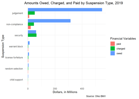
Three suspension types dominate the financial realm. Judgement suspensions occur when there is a judgement against a driver as the result of a lawsuit. Non-compliance suspensions were mentioned above, and security suspensions occur
when a property damage or personal injury claim greater than $400 is filed with the Ohio BMV.
The differences between the blue, green and pink bars is worth noting. Because the amount paid in a typical year (pink) is less than the amount that is charged (green), the amount owed (blue) accrues over time. These additional financial burdens are
difficult for households to overcome.
Debt-Related Suspensions, Poverty and Race
We were curious to know how the distribution of DRS corresponded to poverty and race. Since we had ZIP Code level detail form the Ohio BMV, we gathered ZIP Code level demographics from the US Census Bureau’s American Community Survey (acs.rds).
Poverty
What is the relationship between the number of suspesions and the poverty rate in Ohio ZIP Codes?
We divided Ohio’s nearly 1200 ZIP Codes into 10 equal groups (deciles) based on their poverty rate. These are shown on the X-axis. The height of the red bars represents the number of DRS in each ZIP Code group.
# Get the suspensions by zip code
tmp_plt_data <- drs_2019 |>
  filter(indicator == "suspensions") |>
  group_by(zip) |>
  summarize(
    suspensions = sum(value)
  )

# Get the ACS data and create quintiles
tmp_dta_acs_q <- acs |>
  mutate(
    p_pov_q = ntile(p_pov, 10),
    p_poc_q = ntile(p_poc, 10)
  )

# Join the two data sets together
plt_drs_pov_poc_dta <- left_join(tmp_plt_data, tmp_dta_acs_q, by = join_by("zip" =="zip")) |>
  na.omit()

# Make the plot
plt_drs_pov_poc_dta |>
    ggplot(aes(x=p_pov_q, y=suspensions)) +
    geom_bar(stat="identity", fill="firebrick") +
    scale_x_continuous(breaks = 1:10,
                       labels=c("Lowest Poverty\nZIPs"," "," "," "," "," "," ", " ", " ", "Highest Poverty\nZIPs"))+
    scale_y_continuous(labels = scales::comma)+
    labs(
      x = "ZIP Codes Grouped by Poverty Rate",
      y = "Number of Suspensions",
      title = "Number of Suspensions by Poverty Rate, 2019",
      caption = "Data sources: Ohio BMV, 2015-2019 ACS (B17001) and author calculations"
      )+
  theme_minimal()

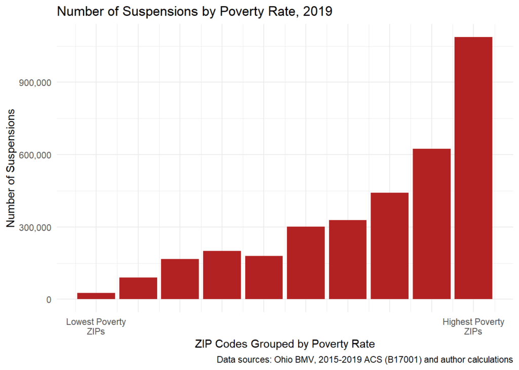
The pattern is pretty striking — almost without exception, the higher the poverty rate, the more debt-related suspensions. In the highest poverty ZIP Codes, over a million DRS — in the lowest poverty ZIP Codes, less than 27,000!
Race
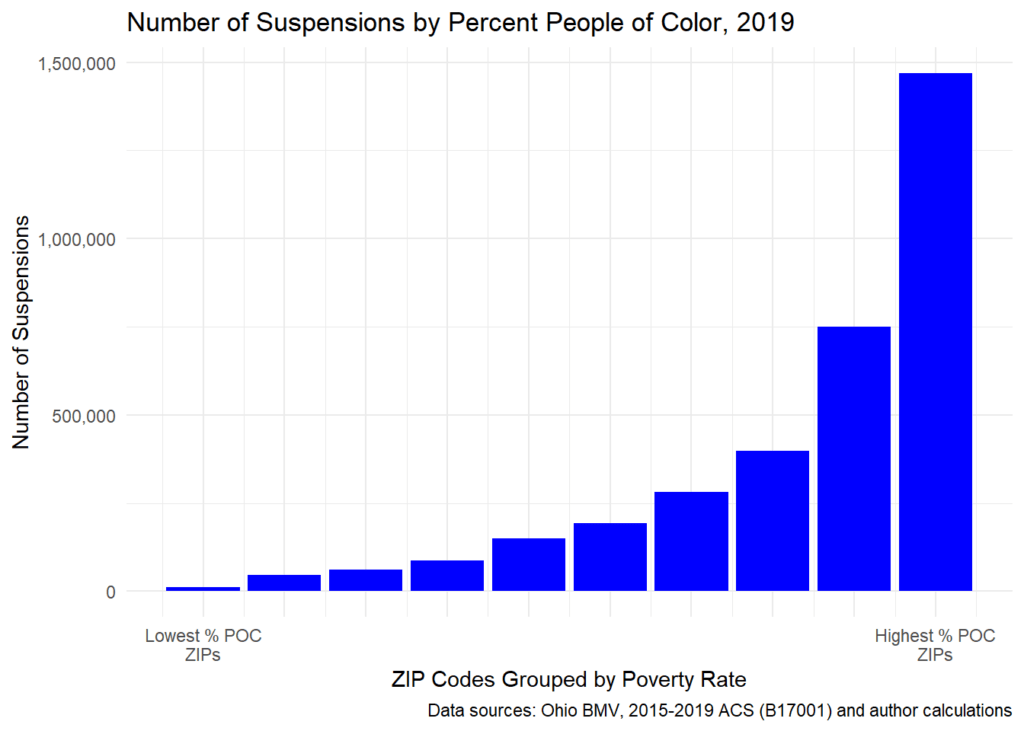
We replicated the above analysis, but this time based on percent People of Color. The results are strikingly similar: Without exception, the more diverse the ZIP Code, the greater the number of debt-related suspensions. In the ZIP Codes with the highest percent People of Color, there were 1.46 million suspensions. In the state’s lowest percent People of Color ZIP Codes, there were fewer than 11,000 suspensions.
plt_drs_pov_poc_dta |>
  ggplot(aes(x=p_poc_q, y=suspensions)) +
  geom_bar(stat="identity", fill="blue") +
  scale_x_continuous(breaks = 1:10,
                     labels=c("Lowest % POC\nZIPs"," "," "," "," "," "," ", " ", " ", "Highest % POC\nZIPs"))+
  scale_y_continuous(labels = scales::comma)+
  labs(
    x = "ZIP Codes Grouped by Poverty Rate",
    y = "Number of Suspensions",
    title = "Number of Suspensions by Percent People of Color, 2019",
    caption = "Data sources: Ohio BMV, 2015-2019 ACS (B17001) and author calculations"
  )+
  theme_minimal()

Poverty and Race
Finally, to look at debt-related suspensions, poverty and race at the same time I’m going to use a grouped box plot. Yes, some data detail is lost in forming groups (i.e., reducing our ratio demographic indicators to ordinal data), but (1) we also looked at partial rank correlations (not detailed here), and (2) we made a lot of community presentations where it was a better idea to share our findings in graphs instead of tables and p-values.
First, we create new quintile variables for the poverty rate and percent People of Color variables. Next, we filter for suspensions in our DRS data, and then join these data together to create what we need for the boxplot.
# Create quintiles
acs_q <- acs |>
  mutate(
    p_pov_q = factor(ntile(p_pov, 5), labels = c("Low", "", "Medium", " ", "High")),
    p_poc_q = factor(ntile(p_poc, 5), labels = c("Low", "", "Medium", " ", "High")),
  )

# Filter for suspensions and aggregate by ZIP Code
tmp_plt_data <- drs_2019 |>
  filter(indicator == "suspensions") |>
  group_by(zip) |>
  summarize(
    suspensions = sum(value)
  )

# Join the data together
plt_box_dta <- left_join(tmp_plt_data, acs_q, by = join_by("zip")) |>
  na.omit()

# create the plot
ggplot(data = plt_box_dta, aes(x=factor(p_pov_q), y = suspensions, fill = factor(p_poc_q)))+
  geom_boxplot()+
  labs(
    title = "Poverty and Race Boxplots, 2019",
    x = "Poverty Rate",
    y = "Number of Suspensions",
    fill = "% People of Color"
  )+
  theme_minimal()

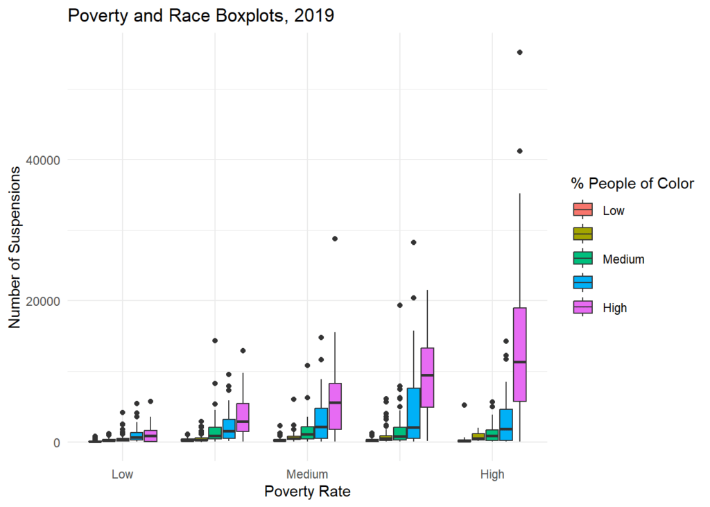
There are two patterns of note in the boxplot:
- First, follow a single percent People of Color box across the five poverty levels. This essentially holds race constant while looking at the effect of poverty. If poverty had no influence on DRS, the five high People of Color purple boxes, for example, would look the same across the different poverty groups. That is not the case here. The number of suspensions steadily increases across poverty groups, from low to high.
- Second, focus on a single poverty rate panel – medium poverty, for example. This essentially holds poverty constant. If race had no influence on DRS, each of the five bars within the medium poverty panel would look the same. This isn’t the case either — suspensions steadily increase across the People of Color categories from low to high.
Although, this post is only meant to provide a snapshot of our analysis (see our white paper for more), the data made it pretty clear that there were a higher number of debt-related suspensions in zipcodes where there was a larger % of people of color and/or a higher poverty rate. Making it clear that policies seeking address the high number of debt-related suspensions should carefully consider race and poverty.
If you’re interested in learning more, you can take a look at the white paper: Road to Nowhere: Debt-Related Driver’s License Suspensions in Ohio, from the Legal Aid Society of Cleveland.
R Resources
R proved to be an invaluable tool in the analysis of these debt-related suspensions data – from integrating the dozens of files and worksheets from our original public records request, to analyzing the distribution across time and space of the suspensions themselves, as well as their financial implications.
While I’m still continuing on my R journey, for those of you that are just setting off on your journey here are some resources that I found to be particularly helpful:
- Stack Overflow is a tremendous site. I’ve never actually asked a question there, but more times than not when I ask Google a
question about R, Stack Overflow is at the top of the results, and the question has already been asked and answered there. - For a more systematic approach to learning R, the second edition of R for Data Science is an excellent source.
- That first Saturday morning R workshop was taught by Rob Kabacoff. Everything he writes about R is helpful. Check out his Quick-R website and books – R in Action 3e and Data Visualization in R.
- Finally, the ‘programming for policy’ seminar series that I took part in was actually the precursor to the online course offered at Policy Analysis Lab (formally program4policy.com), which I found to be really helpful. When I took the course it was offered online at 10 PM on Sunday night — not my ideal time for learning! But even at that late hour, the course was very good. Each week had a different policy scenario, associated data, and a starter R script file that we would have to alter and add to. Between sessions there was help available (I needed it!). As the weeks (and our skills) progressed, we were responsible for more and more of our own R code. The course was an excellent foundation for learning R.
Related

